More Homes for Sale Isn’t a Warning Sign – It's Your Buying OpportunityMaybe you’ve heard that the number of homes for sale has reached a recent high. This might lead you to

Dated: September 28 2022
Views: 88
With all the headlines and buzz in the media, some consumers believe the market is in a housing bubble. As the housing market shifts, you may be wondering what’ll happen next. It’s only natural for concerns to creep in that it could be a repeat of what took place in 2008. The good news is, there’s concrete data to show why this is nothing like the last time.
The supply of inventory needed to sustain a normal real estate market is approximately six months. Anything more than that is an overabundance and will causes prices to depreciate. Anything less than that is a shortage and will lead to continued price appreciation.
For historical context, there were too many homes for sale during the housing crisis (many of which were short sales and foreclosures), and that caused prices to tumble. Today, supply is growing, but there’s still a shortage of inventory available.
The graph below uses data from the National Association of Realtors (NAR) to show how this time compares to the crash. Today, unsold inventory sits at just a 3.0-months’ supply at the current sales pace.
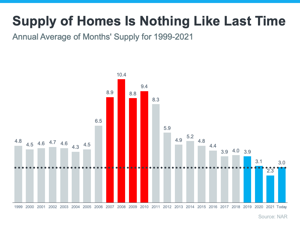
One of the reasons inventory is still low is because of sustained underbuilding. When you couple that with ongoing buyer demand as millennials age into their peak homebuying years, it continues to put upward pressure on home prices. That limited supply compared to buyer demand is why experts forecast home prices won’t fall this time.
During the lead-up to the housing crisis, it was much easier to get a home loan than it is today. The graph below showcases data on the Mortgage Credit Availability Index (MCAI) from the Mortgage Bankers Association (MBA). The higher the number, the easier it is to get a mortgage.
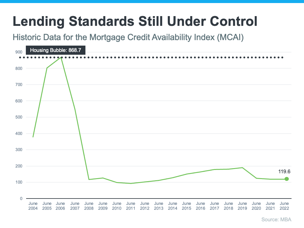
Running up to 2006, banks were creating artificial demand by lowering lending standards and making it easy for just about anyone to qualify for a home loan or refinance their current home. Back then, lending institutions took on much greater risk in both the person and the mortgage products offered. That led to mass defaults, foreclosures, and falling prices.
Today, things are different, and purchasers face much higher standards from mortgage companies. Mark Fleming, Chief Economist at First American, says:
“Credit standards tightened in recent months due to increasing economic uncertainty and monetary policy tightening.”
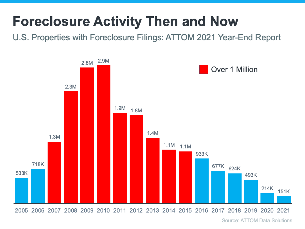
Stricter standards, like there are today, help prevent a risk of a rash of foreclosures like there was last time.
The most obvious difference is the number of homeowners that were facing foreclosure after the housing bubble burst. Foreclosure activity has been on the way down since the crash because buyers today are more qualified and less likely to default on their loans. The graph below uses data from ATTOM Data Solutions to help tell the story:
In addition, homeowners today are equity rich, not tapped out. In the run-up to the housing bubble, some homeowners were using their homes as personal ATMs. Many immediately withdrew their equity once it built up. When home values began to fall, some homeowners found themselves in a negative equity situation where the amount they owed on their mortgage was greater than the value of their home. Some of those households decided to walk away from their homes, and that led to a wave of distressed property listings (foreclosures and short sales), which sold at considerable discounts that lowered the value of other homes in the area.
Today, prices have risen nicely over the last few years, and that’s given homeowners an equity boost. According to Black Knight:
“In total, mortgage holders gained $2.8 trillion in tappable equity over the past 12 months – a 34% increase that equates to more than $207,000 in equity available per borrower. . . .”
With the average home equity now standing at $207,000, homeowners are in a completely different position this time.
If you’re worried we’re making the same mistakes that led to the housing crash, the graphs above should help alleviate your concerns. Concrete data and expert insights clearly show why this is nothing like the last time.

Welcome to my world of real estate, where my passion for helping clients like you find their dream home or navigate successful selling is more than just a profession—it's my purpose. I'm Marcus ....
More Homes for Sale Isn’t a Warning Sign – It's Your Buying OpportunityMaybe you’ve heard that the number of homes for sale has reached a recent high. This might lead you to
Housing Market Forecasts for the Second Half of 2025From rising home prices to mortgage rate swings, the housing market has left a lot of people wondering what’s next – and whether now
Why Today’s Foreclosure Numbers Aren’t a Warning SignWhen it feels like the cost of just about everything is rising, it’s only natural to wonder what that means for the housing
Curious about where the housing market is headed in 2025? The good news is that experts are offering some promising forecasts, especially when it comes to two key factors that directly affect your
 The data relating to real estate for sale on this web site comes in part from the Internet Data Exchange of the Greater Lehigh Valley REALTORS®. Real Estate listings held by brokerage firms (licensees) other than #firm are marked with the IDX logo and detailed information about them includes the name of the listing brokers.
The information being provided is for consumers personal, non-commercial use and may not be used for any purpose other than to identify prospective properties consumers
may be interested in purchasing.
Data last updated September 27, 2026 4:21 PM UTC
Show More...
The data relating to real estate for sale on this web site comes in part from the Internet Data Exchange of the Greater Lehigh Valley REALTORS®. Real Estate listings held by brokerage firms (licensees) other than #firm are marked with the IDX logo and detailed information about them includes the name of the listing brokers.
The information being provided is for consumers personal, non-commercial use and may not be used for any purpose other than to identify prospective properties consumers
may be interested in purchasing.
Data last updated September 27, 2026 4:21 PM UTC
Show More...
 ©2026 Georgia Multiple Listing Service All information deemed reliable but not guaranteed. All properties are subject to prior sale, change or withdrawal. Neither listing broker(s) or information provider(s) shall be responsible for any typographical errors, misinformation, misprints and shall be held totally harmless. Listing(s) information is provided for consumer's personal, non-commercial use and may not be used for any purpose other than to identify prospective properties consumers may
be interested in purchasing. The data relating to real estate for sale on this website comes in part from the Internet Data Exchange program of the Multiple Listing Service. Real estate listings held by brokerage firms other than The Brokers Realty Group Limited may be marked with the Internet Data Exchange logo and detailed information about those properties will include the name of the listing broker(s) when required by the MLS. Copyright ©2026 All rights reserved.
Last Updated: September 27, 2026 4:16 PM UTC
Show More...
©2026 Georgia Multiple Listing Service All information deemed reliable but not guaranteed. All properties are subject to prior sale, change or withdrawal. Neither listing broker(s) or information provider(s) shall be responsible for any typographical errors, misinformation, misprints and shall be held totally harmless. Listing(s) information is provided for consumer's personal, non-commercial use and may not be used for any purpose other than to identify prospective properties consumers may
be interested in purchasing. The data relating to real estate for sale on this website comes in part from the Internet Data Exchange program of the Multiple Listing Service. Real estate listings held by brokerage firms other than The Brokers Realty Group Limited may be marked with the Internet Data Exchange logo and detailed information about those properties will include the name of the listing broker(s) when required by the MLS. Copyright ©2026 All rights reserved.
Last Updated: September 27, 2026 4:16 PM UTC
Show More...
 The data relating to real estate for sale on this web site includes listings held by MLS-IDX Participants of the Internet Data Exchange program of the Multiple Listing Service of the Pocono Mountains Association of Realtors®. Listings marked with the Internet Data Exchange logo are not necessarily the listings of the owner of this web site. All listing data is the copyrighted property of the aforesaid Association and its MLS-IDX Participants with all rights reserved. The information contained
herein is believed to be accurate, but no warranty as such is expressed or implied.
Show More...
The data relating to real estate for sale on this web site includes listings held by MLS-IDX Participants of the Internet Data Exchange program of the Multiple Listing Service of the Pocono Mountains Association of Realtors®. Listings marked with the Internet Data Exchange logo are not necessarily the listings of the owner of this web site. All listing data is the copyrighted property of the aforesaid Association and its MLS-IDX Participants with all rights reserved. The information contained
herein is believed to be accurate, but no warranty as such is expressed or implied.
Show More...
 © BRIGHT, All Rights Reserved
Information Deemed Reliable But Not Guaranteed
The data relating to real estate for sale on this website appears in part through the BRIGHT Internet Data Exchange program, a voluntary cooperative exchange of
property listing data between licensed real estate brokerage firms in which
participates, and is provided by BRIGHT through a licensing agreement.
The information provided by this website is for the personal,
non-commercial use of consumers and may not be used for any purpose other than to identify prospective properties consumers may be interested in purchasing.
Data last updated: September 27, 2026 3:18 PM UTC
Some properties which appear for sale on this website may no longer be available
because they are under contract, have Closed or are no longer being offered for sale.
Some real estate firms do not participate in IDX and their listings do not appear on this website. Some properties listed with participating firms do not appear on this website at the request of the seller.
Show More...
 Luzerne County Association of REALTORS® (LZCAOR) All information deemed reliable but not guaranteed. All properties are subject to prior sale, change or withdrawal. Neither listing broker(s) or information provider(s) shall be responsible for any typographical errors, misinformation, misprints and shall be held totally harmless. Listing(s) information is provided for consumer's personal, non-commercial use and may not be used for any purpose other than to identify prospective properties consumers may be interested in purchasing. The data relating to real estate for sale on this website comes in part from the Internet Data Exchange program of the Multiple Listing Service. Real estate listings held by brokerage firms other than The Brokers Realty Group Limited may be marked with the Internet Data Exchange logo and detailed information about those properties will include the name of the listing broker(s) when required by the MLS. Copyright ©2026 All rights reserved.
Last Updated: September 27, 2026 4:20 PM UTC
Luzerne County Association of REALTORS® (LZCAOR) All information deemed reliable but not guaranteed. All properties are subject to prior sale, change or withdrawal. Neither listing broker(s) or information provider(s) shall be responsible for any typographical errors, misinformation, misprints and shall be held totally harmless. Listing(s) information is provided for consumer's personal, non-commercial use and may not be used for any purpose other than to identify prospective properties consumers may be interested in purchasing. The data relating to real estate for sale on this website comes in part from the Internet Data Exchange program of the Multiple Listing Service. Real estate listings held by brokerage firms other than The Brokers Realty Group Limited may be marked with the Internet Data Exchange logo and detailed information about those properties will include the name of the listing broker(s) when required by the MLS. Copyright ©2026 All rights reserved.
Last Updated: September 27, 2026 4:20 PM UTC
 Susquehanna Valley Board of REALTORS® All information deemed reliable but not guaranteed. All properties are subject to prior sale, change or withdrawal. Neither listing broker(s) or information provider(s) shall be responsible for any typographical errors, misinformation, misprints and shall be held totally harmless. Listing(s) information is provided for consumer's personal, non-commercial use and may not be used for any purpose other than to identify prospective properties consumers may be
interested in purchasing. The data relating to real estate for sale on this website comes in part from the Internet Data Exchange program of the Multiple Listing Service. Real estate listings held by brokerage firms other than The Brokers Realty Group Limited may be marked with the Internet Data Exchange logo and detailed information about those properties will include the name of the listing broker(s) when required by the MLS. Copyright ©2026 All rights reserved.
Last Updated: September 27, 2026 4:18 PM UTC
Show More...
Susquehanna Valley Board of REALTORS® All information deemed reliable but not guaranteed. All properties are subject to prior sale, change or withdrawal. Neither listing broker(s) or information provider(s) shall be responsible for any typographical errors, misinformation, misprints and shall be held totally harmless. Listing(s) information is provided for consumer's personal, non-commercial use and may not be used for any purpose other than to identify prospective properties consumers may be
interested in purchasing. The data relating to real estate for sale on this website comes in part from the Internet Data Exchange program of the Multiple Listing Service. Real estate listings held by brokerage firms other than The Brokers Realty Group Limited may be marked with the Internet Data Exchange logo and detailed information about those properties will include the name of the listing broker(s) when required by the MLS. Copyright ©2026 All rights reserved.
Last Updated: September 27, 2026 4:18 PM UTC
Show More...
